
Approach the making of the wall labels you place next to your artwork with thoughtfulness and common sense.
The Basics for Exhibition Labels Next to Your Art
Many art exhibitions open with a statement by the curator or artist. Those longer labels give context to what the viewer is about to see and are placed at the entry to the show.
Then there are individual labels next to each artwork.
Your art labels should include your , object title, and media/support/technique—at a minimum.
A retrospective of your work should also include the dates.
In a one-person exhibition, your name need not be as prominent on labels and you might, instead, make the title larger and put it before your name.
When showing with other people, distinguishing between artists is more important and names should be first.
If there are multiple rooms in the exhibition and your show’s title text doesn’t appear anywhere near your works, you might need your name on every label.
If your work is hanging at a restaurant where a customer could stare at it for longer periods of time, your name should be on every label.
If the exhibit is small or in a single room and there’s a large sign with your name on it, you probably don’t need your name on every label.
Size of Wall Labels for Your Art
The size of your labels depends on the size of the art, the size of the font you use, and the size of the crowd expected. Museums that expect huge crowds for blockbuster shows need larger labels so they can be read from farther away and over other people’s heads.
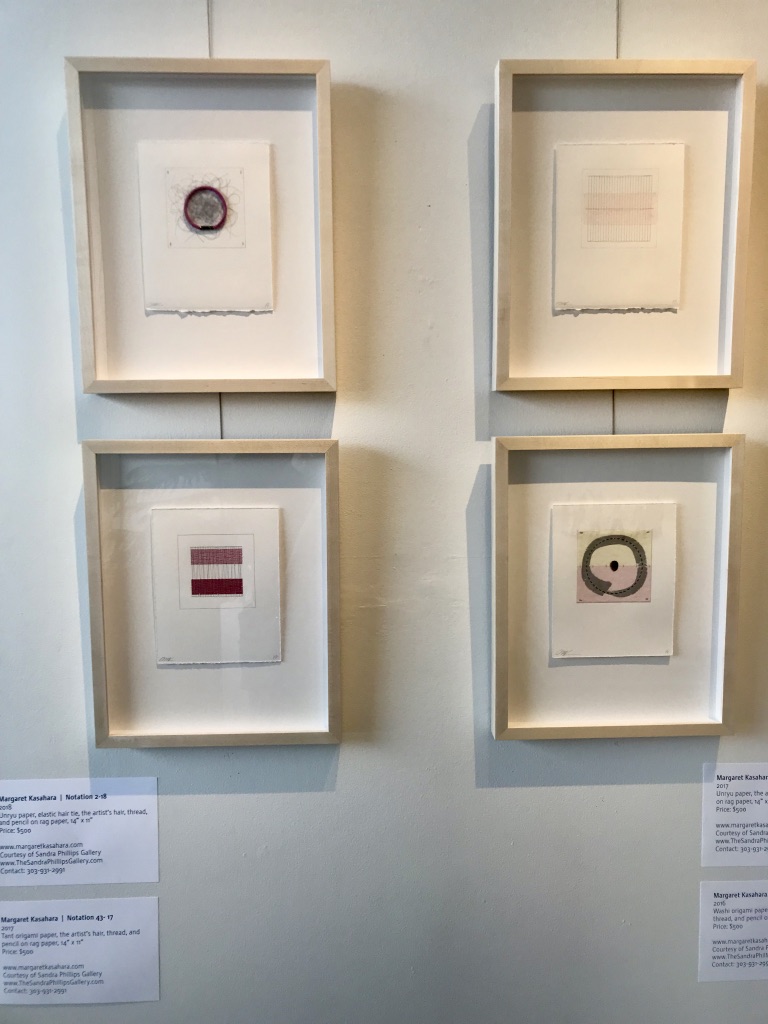
But large labels tend to look silly next to small works, like Margaret Kasahara’s in the image above. I love love love Margaret’s work, but the labels seem to be as important as the work.
Labels used to be a lot smaller—think business-card-sized—until studies showed that they were hard to read. Make the font size at least 14 points. Larger is better when you want the majority of your audience to be able to read the labels.
No need for large margins around the text on a label. Crop it closely.
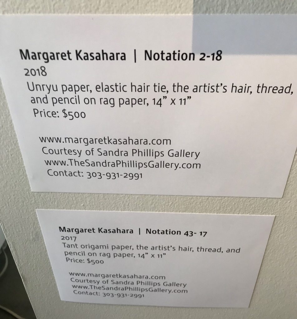
You can include more than one artwork on a label (as in the image to the right) as long as viewers can discern which information belongs with which piece.
1 Art Label, 3 Ways
Traditionally, titles of artworks are italicized. You could, instead, make them bold, all caps or larger than the other text. Distinguishing the titles is especially important if they give clues about the content of your work, such as the location of a landscape.
“Mixed media” isn’t a medium. Using it is like saying something is a “painting” instead of “oil on linen” or “sculpture” instead of “bronze.” Spell out the various media you use within each mixed-media artwork. A curator is going to ask you that later anyway, so you might as well start treating your art like it’s in a museum now.
If the work is for sale, show the sale price on the label next to the art.
Labels can be printed on cardstock and stuck on the wall with rolled masking tape or something like Elmer’s Tack removable adhesive putty. I don’t recommend using the latter on textured walls because the adhesive gets caught in between the bumps.
For a more polished presentation print labels on regular paper, adhere the paper to mat board with spray glue, then cut out with a mat cutter.
Labels within an exhibition should all be the same size unless there is need for longer, explanatory text.
Place object labels to the right if at all possible. Large sculpture may require that you place a label on the nearest wall or floor.
Hang all labels at the same height and use a level to make sure they are parallel to the floor.
Art Label Cheat Sheet
- Viewers must be able to see your name when looking at your work.
- People shouldn’t have to guess what your work is made of.
- The price, if for sale, should be clear.
- Exhibition labels should be thoughtfully made. Any crooked sides or torn edges will detract from an appreciation of your work.
- Above all, the labels should be consistent throughout the exhibition.
Your Art Exhibition Installation
Compose your art show just as you would a composition. Each aspect can contribute to the success of the show or make it seem less than impressive.
It begins with curating the work, but there is so much more that goes into a successful exhibition: preparation, installation, documentation, marketing, self-promotion, follow-up and more.
The post Pointers on Wall Labels for Your Art Exhibition appeared first on Art Biz Success.
This content was originally published here.